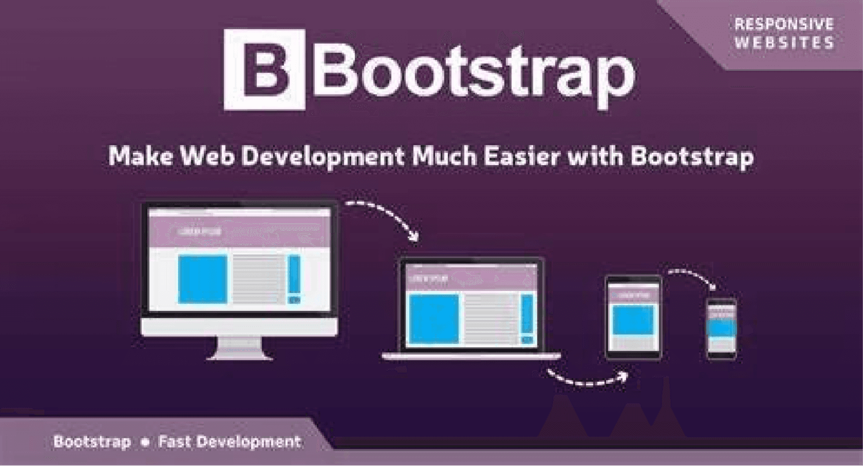
In today’s world, building a responsive website is essential to ensure a great user experience across all devices. Bootstrap, a popular front-end framework, provides all the necessary tools to build such responsive web pages with minimal effort. In this blog, we’ll explore how to build a responsive webpage using Bootstrap’s grid system, components, and utilities.
What is Bootstrap and Why Should You Use It?
Before we jump into the code, let’s quickly answer the question: What is Bootstrap?
Bootstrap is a free, open-source front-end framework that helps you build websites and web applications. It’s packed with pre-designed components like navigation bars, buttons, forms, modals, and more — all ready to be used with just a few lines of code. One of the main advantages of Bootstrap is that it’s mobile-first and fully responsive, meaning it automatically adapts to different screen sizes and devices.
Getting Started with Bootstrap
First things first, we need to add Bootstrap to our project. You can either download Bootstrap and include it locally in your project or simply use a Content Delivery Network (CDN). For simplicity, let’s go with the CDN method.
Here’s how to include Bootstrap in your project:
<!-- Bootstrap CDN --><link href="https://cdn.jsdelivr.net/npm/bootstrap@5.3.3/dist/css/bootstrap.min.css" rel="stylesheet" integrity="sha384-QWTKZyjpPEjISv5WaRU9OFeRpok6YctnYmDr5pNlyT2bRjXh0JMhjY6hW+ALEwIH" crossorigin="anonymous">
<!-- Bootstrap CDN --><link href="https://cdn.jsdelivr.net/npm/bootstrap@5.3.3/dist/css/bootstrap.min.css" rel="stylesheet" integrity="sha384-QWTKZyjpPEjISv5WaRU9OFeRpok6YctnYmDr5pNlyT2bRjXh0JMhjY6hW+ALEwIH" crossorigin="anonymous">
<!-- Bootstrap CDN --><link href="https://cdn.jsdelivr.net/npm/bootstrap@5.3.3/dist/css/bootstrap.min.css" rel="stylesheet" integrity="sha384-QWTKZyjpPEjISv5WaRU9OFeRpok6YctnYmDr5pNlyT2bRjXh0JMhjY6hW+ALEwIH" crossorigin="anonymous">
<!-- Bootstrap CDN --><link href="https://cdn.jsdelivr.net/npm/bootstrap@5.3.3/dist/css/bootstrap.min.css" rel="stylesheet" integrity="sha384-QWTKZyjpPEjISv5WaRU9OFeRpok6YctnYmDr5pNlyT2bRjXh0JMhjY6hW+ALEwIH" crossorigin="anonymous">
With this simple line of code, we’ve imported Bootstrap into our project, and we’re ready to use its classes to create a responsive layout.
Setting Up the Layout
Now, let’s create a simple webpage layout with a header, a sidebar, and a main content area. We’ll use Bootstrap’s grid system to structure the page.
Here’s the code:
<!DOCTYPE html>
<html lang="en">
<head>
<meta charset="UTF-8">
<meta name="viewport" content="width=device-width, initial-scale=1.0">
<title>Responsive Web Page with Bootstrap</title>
<!-- Bootstrap CDN -->
<link href="https://cdn.jsdelivr.net/npm/bootstrap@5.3.3/dist/css/bootstrap.min.css" rel="stylesheet">
</head>
<body>
<!-- Header Section -->
<header class="bg-dark text-light p-4">
<div class="container">
<h1 class="text-center">Responsive Web Page</h1>
<p class="text-center">Built with Bootstrap</p>
</div>
</header>
<!-- Main Content Section -->
<div class="container-fluid">
<div class="row">
<!-- Sidebar Section -->
<div class="col-md-3 bg-light p-4">
<h4>Sidebar</h4>
<ul class="list-unstyled">
<li><a href="#">Home</a></li>
<li><a href="#">About</a></li>
<li><a href="#">Contact</a></li>
</ul>
</div>
<!-- Main Content Section -->
<div class="col-md-9 p-4">
<h2>Understanding the Grid System</h2>
<p>The Bootstrap grid system is based on a 12-column layout. It allows you to create flexible and responsive web pages. Let’s dive into how it works:</p>
<div class="row">
<div class="col-md-4">
<div class="card">
<img src="https://via.placeholder.com/150" class="card-img-top" alt="Card image">
<div class="card-body">
<h5 class="card-title">Card Title 1</h5>
<p class="card-text">This is a simple card with some text inside it. Bootstrap makes it easy to structure and style your content.</p>
</div>
</div>
</div>
</div>
</div>
</div>
</div>
<!-- Footer Section -->
<footer class="bg-dark text-light p-3 text-center">
<p>© 2025 My Responsive Web Page</p>
</footer>
<!-- Bootstrap JS and Popper.js -->
<script src="https://cdn.jsdelivr.net/npm/@popperjs/core@2.11.8/dist/umd/popper.min.js"></script>
<script src="https://cdn.jsdelivr.net/npm/bootstrap@5.3.3/dist/js/bootstrap.min.js"></script>
</body>
</html><!DOCTYPE html>
<html lang="en">
<head>
<meta charset="UTF-8">
<meta name="viewport" content="width=device-width, initial-scale=1.0">
<title>Responsive Web Page with Bootstrap</title>
<!-- Bootstrap CDN -->
<link href="https://cdn.jsdelivr.net/npm/bootstrap@5.3.3/dist/css/bootstrap.min.css" rel="stylesheet">
</head>
<body>
<!-- Header Section -->
<header class="bg-dark text-light p-4">
<div class="container">
<h1 class="text-center">Responsive Web Page</h1>
<p class="text-center">Built with Bootstrap</p>
</div>
</header>
<!-- Main Content Section -->
<div class="container-fluid">
<div class="row">
<!-- Sidebar Section -->
<div class="col-md-3 bg-light p-4">
<h4>Sidebar</h4>
<ul class="list-unstyled">
<li><a href="#">Home</a></li>
<li><a href="#">About</a></li>
<li><a href="#">Contact</a></li>
</ul>
</div>
<!-- Main Content Section -->
<div class="col-md-9 p-4">
<h2>Understanding the Grid System</h2>
<p>The Bootstrap grid system is based on a 12-column layout. It allows you to create flexible and responsive web pages. Let’s dive into how it works:</p>
<div class="row">
<div class="col-md-4">
<div class="card">
<img src="https://via.placeholder.com/150" class="card-img-top" alt="Card image">
<div class="card-body">
<h5 class="card-title">Card Title 1</h5>
<p class="card-text">This is a simple card with some text inside it. Bootstrap makes it easy to structure and style your content.</p>
</div>
</div>
</div>
</div>
</div>
</div>
</div>
<!-- Footer Section -->
<footer class="bg-dark text-light p-3 text-center">
<p>© 2025 My Responsive Web Page</p>
</footer>
<!-- Bootstrap JS and Popper.js -->
<script src="https://cdn.jsdelivr.net/npm/@popperjs/core@2.11.8/dist/umd/popper.min.js"></script>
<script src="https://cdn.jsdelivr.net/npm/bootstrap@5.3.3/dist/js/bootstrap.min.js"></script>
</body>
</html>Explaining the Code
Let’s break it down:
1. Header Section:
The header has a dark background (bg-dark), and the text is light (text-light). The p-4 class gives some padding to the header. Inside, we have a container that centers the content (text-center).
2. Main Content Section:
We are using the Bootstrap grid system here. The .row class creates a row in which columns can be placed. The col-md-3 for the sidebar and col-md-9 for the main content area ensure that the sidebar takes up 3/12 of the screen and the content takes up the remaining 9/12 on medium to large screens (on smaller screens, these will stack vertically).
Inside the main content area, I’ve used Bootstrap cards. These are flexible content containers that are perfect for displaying a range of content (like images, titles, and text).
3. Responsive Design:
Now, let’s make the layout responsive. Thanks to Bootstrap’s grid system, it’s super easy to adapt your layout to different screen sizes.
Bootstrap uses media queries to automatically adjust the layout based on the device’s screen size. For example:
On large screens, the sidebar and main content will sit side by side.
On medium screens (like tablets), the layout will stack vertically.
On small screens (like phones), the layout will also stack vertically.
Let’s test this by resizing your browser window or using your browser’s developer tools to simulate different devices.
Real-time Example:
On a large screen (desktop): The sidebar will sit on the left and the content on the right, each taking up 3/12 and 9/12 of the screen, respectively.
On a medium screen (tablet): The layout will adjust and stack the sidebar on top of the main content.
On a small screen (smartphone): Both the sidebar and content will stack vertically for better readability.
4. Footer Section:
The footer uses the same dark background as the header, keeping a consistent look across the page.
Real-time Example of How It Looks:
On a large screen (like a laptop or desktop), you’ll see the sidebar and the main content side by side.
On a medium screen (like a tablet), the columns will stack to ensure the layout is still usable.
On a small screen (like a phone), the content will stack vertically, with the sidebar on top and the main content beneath it.
Customizing the Layout with Bootstrap Utilities
If you want to make the layout even more attractive, you can use some Bootstrap utility classes. For example, to add space between the cards or change their colors, you could do the following:
<div class="card bg-light">
    <img src="https://via.placeholder.com/150" class="card-img-top" alt="Card Image">
    <div class="card-body">
        <h5 class="card-title">Card Title 1</h5>
        <p class="card-text">This is a card with a light background.</p>
    </div>
</div><div class="card bg-light">
<img src="https://via.placeholder.com/150" class="card-img-top" alt="Card Image">
<div class="card-body">
<h5 class="card-title">Card Title 1</h5>
<p class="card-text">This is a card with a light background.</p>
</div>
</div><div class="card bg-light">
<img src="https://via.placeholder.com/150" class="card-img-top" alt="Card Image">
<div class="card-body">
<h5 class="card-title">Card Title 1</h5>
<p class="card-text">This is a card with a light background.</p>
</div>
</div><div class="card bg-light">
<img src="https://via.placeholder.com/150" class="card-img-top" alt="Card Image">
<div class="card-body">
<h5 class="card-title">Card Title 1</h5>
<p class="card-text">This is a card with a light background.</p>
</div>
</div>Conclusion
Congratulations! You’ve just built your first responsive web page using Bootstrap. You’ve learned how to use Bootstrap’s grid system to create layouts that adapt to different screen sizes and components like cards to structure your content. This is just the beginning — Bootstrap offers much more, such as navigation bars, modals, buttons, and forms that you can easily integrate into your website.
By using Bootstrap, you can save a ton of time and create beautiful, responsive web pages without writing a lot of custom CSS. Whether you’re building a personal blog, a business site, or even a web app, Bootstrap has you covered.
I hope this guide was helpful! If you have any questions or need further clarification, feel free to leave a comment below. Happy coding!
